Chris Game
In 1967/68, while attempting concurrently, and unsuccessfully, to write a PhD thesis and earn enough to live, I had the good fortune to work as research assistant to the late Anthony King, well-known and respected Professor of Government, writer, broadcaster, and public intellectual. One of the two people who most shaped my so-called career, King wasn’t himself really a ‘psephologist’ – a statistical analyst of elections and voting patterns – but he was seriously interested in such things, including voter registration.
As a Canadian, he was familiar with this being a federal responsibility relying (then) on huge numbers of enumerators canvassing door-to-door, repeatedly if necessary, to produce a national register noted for both its completeness and accuracy – and thereby a complete contrast to the US’ almost entirely decentralised, and politicised, state-run process.
Knowing broadly how the UK resembled the US in not just decentralising electoral administration but in our case to a lower-tier of often quite small councils, King was instinctively sceptical about both UK registers’ completeness and accuracy and about whether indeed these things were even measured. My mission was to find out.
In one sense it was easy. Two decades before the register-based Community Charge was invented, over three before we had a national Electoral Commission, and over four before the arrival (outside Northern Ireland) of Individual Voter Registration, hardly anyone seemed exercised by either part of the question.
An erstwhile University of Birmingham colleague, Kenneth Newton, provided a pleasing illustration in his 1976 book, Second City Politics. After cautioning how high reported percentage turnouts can often be a product of low levels of electoral registration, he noted (p.22) the “extraordinarily high proportion of adults on the electoral register in Birmingham” – over 99% in 1951.
Which he then contextualised, recording the council election office’s proud boast of how, while of course endeavouring to contact and encourage voters to return their annual registration forms, its policy was to keep as many names on the register as possible, removing them only when it was certain that they were dead or had moved.
Newton doesn’t say whether he inquired what would happen if the figure reached over 100%, as indeed it can (see below). But the unmistakeable point is that, even had they been measurable, the statistical accuracy and precision of registers were not in this era anyone’s serious priority.
It’s useful, though, to recognise what, for instance, the apparently impressive estimates of ‘96% completeness’ recorded in the occasional early research studies (see graph) actually meant. They were the percentages of electors found registered at the correct address during the autumn annual canvass the previous year.
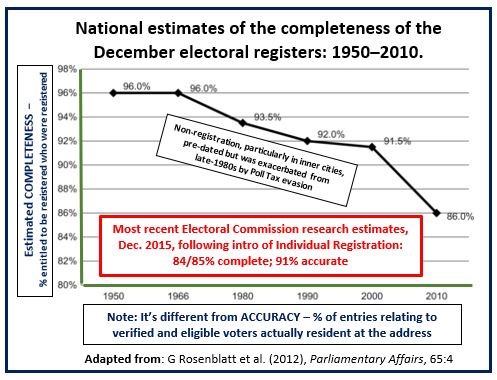
However, by December, when the registers went live, the figures were already down a few percent, and, in an autumn election, towards the end of a register’s life, the proportions of correctly registered electors would have dropped to around 86% – and significantly lower among younger potential voters, in minority ethnic communities, and in inner cities generally.
Then, in 1990, came the Community Charge, followed swiftly by analyses of the 1991 Census suggesting that up to a ‘Missing Million’ people may have absented themselves from the Census returns (Wilks-Heeg, 2012, p.19). It seemed clear that many disbelieved – with some justification – that their councils’ electoral and community charge registers were as totally insulated as they were being assured (Smith & McLean, 1992, p.6).
By now there was growing interest in registers of all sorts, with evidence suggesting (p.19) that in 1992, with deliberate absentees from electoral registers and/or the Census being disproportionately Labour or Liberal Democrat voters, the outcomes of up to 10 parliamentary contests could have been affected in a General Election the Conservatives won with a Commons majority of 21. But it took the long overdue arrival of the Electoral Commission in 2001 and the 2003 introduction of Individual Elector Registration in Northern Ireland for the extent and composition of non-registration to be researched at all rigorously.
This is not the place for even a summary of that research, but the headline statistics from the Commission’s most recent work are those in the red box on the graph: local government registers assessed as 91% accurate and 84% complete, parliamentary registers as 91% accurate and 85% complete.
Unsurprisingly, but particularly significant in the present political context, highest levels of completeness were for over-65s (96%), lowest for 16/17-year old ‘attainers’ (45%), then 18/19s (65%) – one of the several factors allowed for, of course, in the YouGov polling data underpinning Peter Kellner’s recent pronouncement of January 19th as Brexit ‘Crossover Day’. This Kellner calculated, was when, if not a single voter in the 2016 Referendum had changed their mind, enough older, mainly Leave voters would have died – at a net rate of about 1,350 a day – and enough mainly Remain voters reached voting age, to wipe out the Leave majority.
Fascinating as this is, this blog’s real purpose is to publicise the estimable and, I’d suggest, important Atlas of Democratic Variation produced not by the Electoral Commission, but, evidently having little else on their hands, by the Cabinet Office. And particularly its 25 choropleth maps – which, in case like me you’ve temporarily forgotten, are thematic maps in which areas are shaded in proportion to the measurement of the statistic displayed – in this case Registration Proportion (RP).
The Atlas’s main purpose, apart from amusing saddos like me, is obviously to inform and support the democratic engagement strategies of Electoral Registration Officers and others. There are cautions aplenty about the maps’ statistical limitations: how RP is a rough indicator, not a quality measure; that a low figure may simply reflect a large ‘ineligible’ population and should certainly not be used to evaluate or start sacking EROs, etc. But they do convey significant information, as indicated in this small illustration of the range of apparent completeness and presumably practice across our own West Midlands metropolitan area.
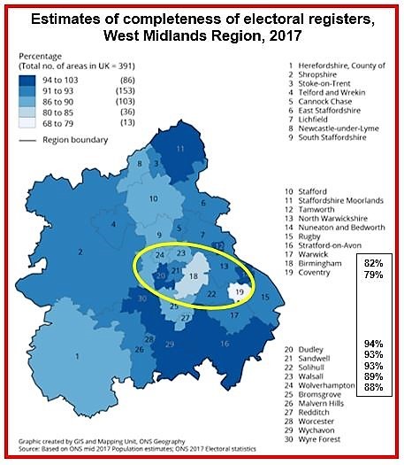
All qualifications accepted, it is hard not to be struck by our just seven metropolitan boroughs, covering not wildly differing socioeconomic areas and populations, managing to span all five of the Atlas’s percentage groupings.
None topped 100% – though it is possible and was achieved, albeit by the highly atypical City of London – but Dudley managed the highest grouping and Coventry the lowest, with Birmingham only just ahead. A 15% spread over something as democratically vital as voter registration: you can question its statistical significance, but surely not its civic relevance.
 Chris Game is a Visiting Lecturer at INLOGOV interested in the politics of local government; local elections, electoral reform and other electoral behaviour; party politics; political leadership and management; member-officer relations; central-local relations; use of consumer and opinion research in local government; the modernisation agenda and the implementation of executive local government.
This blog post was first published by The Chamberlain Files
The views in this blog represent those of the author and not those of INLOGOV or the University of Birmingham.
