It’s 100 days since the election of our first six Combined Authority mayors – a symbolic juncture that a year ago prompted quite a debate about new London Mayor Sadiq Khan’s impressive output of announcements and initiatives and also the substance behind them.
It would be good to attempt a similar overview of the records of the new CA mayors, but, sad to admit, that’s beyond the capability of this blogger at this time. But even sadder, I felt, to ignore the date completely, and I’ve therefore pinched (sorry, was inspired by, as we say in academia) the thought behind the opening musings of Local Government Chronicle editor Nick Golding’s recent column on CAs.
By their choice of corporate logos, at least, he was unimpressed: “curiously similar symbols … series of coloured dots or slivers that come together in a wheel or a line”, and likely to leave their wider populations cold and/or bewildered. They could easily represent, he suggested, a legal partnership, or one of the management consultancies involved in their design, none being “as emotive as Warwickshire’s bear and ragged staff, Liverpool’s liver bird, or the white rose of Yorkshire.”
Overlooking that Googling ‘white rose logo’ nowadays will get you an insurance company, a shopping centre, and a facelift long before you get anywhere near a council, you can see his point. And if you don’t, see what you make of this lot:
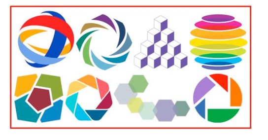
These certainly colourful creations include the logos of – and in five cases specifically commissioned for – our six new CAs, presumably designed to communicate at a glance to local residents something really distinctive about their identity and function. Just to remind you, and in case most seem worryingly interchangeable, we’re looking for Greater Manchester, Liverpool City Region, Tees Valley, West Midlands, West Yorkshire, and Cambridge/Peterborough. Oh yes, and, assuming they’d surely be easily distinguishable, I added in a couple of popular private sector logos.
Of course, the CAs – and indeed you – could reasonably point out that these symbols are generally accompanied by the CA’s actual name. Which is true – but in turn prompts the question: so why bother with the indecipherable and hardly costless logo?
As it happens, one – the proverbial granddaddy CA,Greater Manchester – hasn’t bothered. The pile of building blocks – each representing, as generally in these logos, a constituent council – is actually the logo of the Association of Greater Manchester Authorities (AGMA), the GMCA’s longstanding and still extant predecessor, and the CA presents itself to the world logo-free.
There is, I think, a serious point here. I know nothing worthwhile about the advertising business, but I do know that a logo’s primary, if not sole, purpose is to identify the product or business, and establish instant brand recognition. These CA logos don’t come close to doing either. Which is why they look fundamentally so different from pretty well all really successful brand logos, which have the product name as an integral part of the logo.
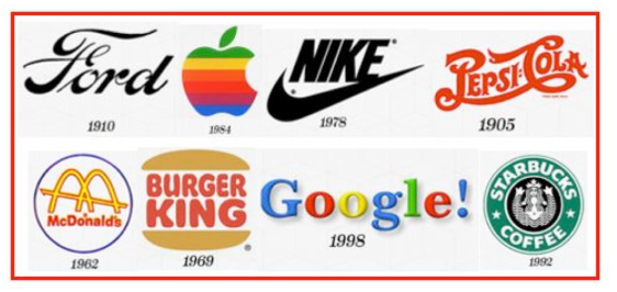
In these earliest versions of the “most iconic brand logos of all time”, before the instant recognition was almost universal, the product name is absolutely central, if not the logo itself – the one exception here being the crazy guy who thought it might be a fun idea to name his computer after part of his fruitarian diet.
Even the Nike ‘Swoosh’, the sole symbol of the company for over two decades now, was for the previous two accompanied by the Nike name. Yet we’re expected to remember whether our CA is the one represented by a pile of coloured plates, a child’s windmill, or a curly string of different-sized hexagons.
Perhaps I’m being unfair, though, comparing these admittedly quite pretty images with those designed to sell some of the most popular products on the planet. So I looked at the logos of the seven constituent councils of our WestMidlands CA. They’re collectively a bit yesterday, but most do at least attempt to integrate their name into the logo design, rather than just sticking it alongside as all the CAs except West Yorkshire do.
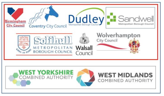
West Yorkshire CA’s slightly more artistic effort, if you hadn’t already checked, is the string of hexagons, representing its five constituent authorities plus the non-constituent City of York – another possibly ‘inspired’ idea, in this case from one that Sandwell made earlier.
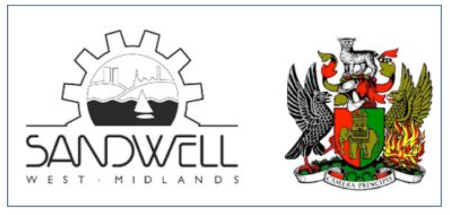
You can see why Sandwell councillors were keen on a makeover. Even without the dreadful events of recent weeks, you probably don’t want tower blocks as a prominent feature in your corporate identity, especially if your housing policy claims to have knocked more of them down than anywhere else in Europe. Surely almost anything’s better than that, even a design that looks disconcertingly like a question mark: possibly ‘What are we all doing here?’ or even ‘Where on earth is Sandwell?’
It derives (of course!) from Sandwell Priory, a small Benedictine monastery near West Bromwich, which, dissolved 450 years previously, could be trusted to cause only moderate offence to councillors representing the six real towns whose civic names would disappear in the 1974 local government reorganisation.
As for Coventry, when you’ve got a genuine 11th Century Lady Godiva with even an embroidered erotic backstory, you wonder how the city’s coat of arms with, in clockwise formation, a black eagle, wild cat, mythical phoenix, and elephant (don’t ask!), lasted so long.
Which brings us to Birmingham’s logo, and what my students used to reckon is the cheekiest bit of corporate political propaganda in English local government. Earnestly as I’d explain about it depicting the city at the heart of England, they’d see two arrows, a smaller Conservative one pointing backwards and a bigger red one pointing forwards, and speculate on how the councillors got away with it.
 Chris Game is a Visiting Lecturer at INLOGOV interested in the politics of local government; local elections, electoral reform and other electoral behaviour; party politics; political leadership and management; member-officer relations; central-local relations; use of consumer and opinion research in local government; the modernisation agenda and the implementation of executive local government.
